Interview with Leigh Williams, Amaranth Designs LLC
How long have you worked as a professional graphic designer and artist? I have worked as a graphic designer since college graduation. Over 30 years.
How did you get interested in the graphic arts? As a child I was always drawing and creating. In second grade, my teacher took notice and awarded me with a Toledo Museum of Art scholarship. I began attending art classes every Saturday for 9 years. That nurtured my creativity and developed my skills as an artist. My parents supported my interest in art and encouraged me throughout my life.
Work history: Graduated college in 3 years with a Bachelors Degree in Fine Arts and a major in Graphic Design and Marketing. I then worked for two Advertising Agencies as a designer. Worked in a corporation as Director of Design department where we provided agency services to Corporate divisions. From there I worked as Creative Director in an Advertising Agency in Ohio where I developed creative strategies and managed a team of designers. After working in the agency world, I decided it was time to start my own business. First as LAW Design and Amaranth Designs LLC today.
When and why did you start your own business, Amaranth Designs? Founded Amaranth Designs in 2008. I wanted to develop creative strategies for a wider range of businesses. Start-ups, not for profits, corporate etc. Interacting directly with customers and developing long-term creative/brand strategies.
How did you choose the name of your business? What does it mean and how did that inspire you as an artist? In Greek mythology Amaranth /Amaranthos was a sacred flower because of its unfading quality and was a symbol of immortality. The Greek word Amaranton is unfading and Anthos is a flower. Meaning the never-fading flower. Brand and logo development is a significant part of my business and my designs last the test of time. I have developed logos and materials that still hold up 20-30 years later. Still viable and relevant. That is how I approach every brand design. It must appeal to current and future customers, relevant to industry, distinctive and unique, memorable, simple, communicate values, timelessness, and adaptability.
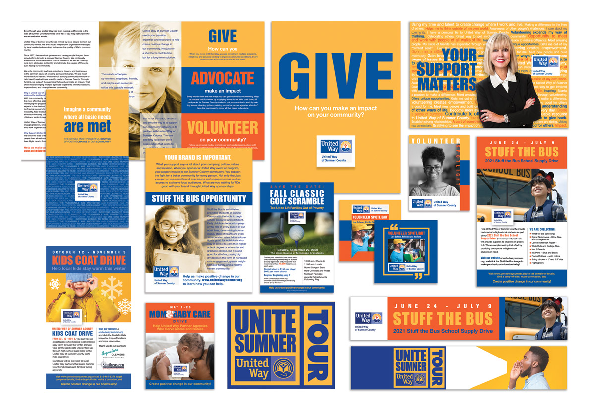
Since 2011, you have worked with United Way of Sumner County on developing marketing materials and more recently concentrating on consistent branding and marketing campaigns. Why did you decide to get involved with United Way of Sumner County? I was asked to be part of a marketing committee to help with the 2011 St Nicholas Ball. I realized that UWSC was unable to develop a long-term strategy for fund-raising event marketing but also for collateral materials. Not enough time and staff to create templates to use throughout the year- every event was a new need for materials. There was a need for consistent creative help. Creating a brand look would make events like “Day of Action” easier each year because a consistent brand was established. That look encompassed the Winter Coat Drive and the Food Drive. We then changed up the yearly “Soiree” event to “Boots and Bling” which created better turn-out and community engagement- then Bloomin’ Bash and now this year’s reimagined event (It’s a secret!) Then onto the everyday use campaign materials. UWSC needed brand consistency. Highlighting the United Way corporate colors of yellow, blue and orange, I created a strong brand look that unifies all of the materials you see today. We are still building on those materials and will have templates for every flyer, brochure, social media ads, posters, banners, etc. When there is a need for a new marketing piece- we will already have the brand look firmly in place so it is much easier to develop. United Way of Sumner County’s brand is loud and clear. We just keep strengthening and building on that brand.
You have local, national and international clients. When working with a client, how do you blend the client’s preferences with your professional aesthetic to create the best design for that client? The most important phase of the design process is to LISTEN. After working in the field of design for so many years- the majority of customers are familiar with my design style so they go into the relationship with a fair amount of trust. They have done their homework and have seen my work.
Ask many questions. I have a questionnaire that I ask customers to fill out. It not only provides me with valuable information- It often helps organizations really think about their values and what they want to convey to their customer. I gather as much information as I can and then research. I look at competitors, I ask about styles, I ask about their customers, goals, business plans, previous marketing results/failures- All information is helpful. When designing a brand logo- I ask my customers to allow me to develop three unique designs based on the information I have gathered. From there, we are in a good place for feedback. We discuss what works and if I need to adjust or pursue a different direction. A typical logo requires a few rounds of layouts- typeface/colors/style etc. I always design what I think is the best solution. Sometimes customers have to “live with the design” for a bit and come back and discuss. Not everyone is on the same “aesthetic” page and my job is to discuss why I made the design decisions. Collaboration is also a great way to get to an amazing design. Again- listening to input is key to understanding what may be important in the design.
Since United Way of Sumner County has specific fonts and color themes (list them here) how do you, as an artist, work within those parameters and still maintain your own creativity while doing the work? I start with the national organization’s brand standards. Then I understand which standards are changeable like images. Identify those colors or elements that can be used to varying degrees to create unique local UW brand. The style of images is one of the ways to create your unique brand- like changing from color to black and white. Using more white space. Reducing the content so that the materials are easier to read and elevates the look. Even within brand guidelines- there is plenty of room for unique design.
When working on a project, how do you begin? Take us through the process of designing a specific piece of art. For me, designing is like solving a puzzle. I typically think about a project for a few days- write ideas down on paper, sketch, work on color pallets, fonts, etc. I then go through information I have gathered from customer- take notes. Start researching competitors. Surround myself with all of my information. Start creating rough sketches. Then I create a digital “work board” and paste all the colors I think will work and collect all the typefaces that might look good. Then I create some of the elements that I have drawn by hand. From there, I move elements and experiment with the organization of content. I do a lot of moving around. Balance. I “know” when a design works. It looks “right”. When I work on a brochure- I design with an imaginary grid and make sure that elements/content require the viewer’s eye to cover top to bottom- sometimes in a zigzag pattern it depends on what message you want your viewer to see first. I will usually have several versions but choose the ones I think are the best. I don’t place any element randomly. Great design is well thought out and planned.
How does designing for digital platforms differ from designing for hard copy materials? Or does it? Yes, designing for digital is different than for print. Print design is static so it does not change/Digital can easily change- images can change added video interactive. Each medium needs to pull the reader in. Print is more straight forward regarding usability- turn pages/open/fold. Digital relies on clear navigation to direct viewer to menus, links etc. If print design looks good printed- you are good to go. Digital has to consider compatability of platforms, fonts, files types/ aspect rations/sizes/size constraints/resolution/ color display- RGB or CMYK print is consistent Digital relies on each devices’ calibration. Print is contained in the physical size of the medium. Digital is limited to the size of device/screen you will view in.
What is your favorite part of design work (typeface, color, etc…) and why? I love the amalgamation of all elements to achieve a brilliant design. Playing with those elements to see what results I can get to really elevate the look and message. It’s a little like cooking… when just the right ingredients are added in just the right amounts- you have created something amazing and memorable.
What is the most challenging part of your profession? Having enough time to work thorough the best solution- whether that is just thinking about the design or actually producing. You need to “prove” that what you have designed is the best approach by exhausting a variety of approaches.
What is most rewarding about your work? Seeing my work online or printed in people’s hands. Knowing that I have designed something that will have an impact.I still LOVE seeing billboards that I have designed- there is something exciting about seeing my design in a huge format!
What is your advice for someone considering a career in graphic arts? You need to be a creative person- it is not something that you wake up some morning and say “I think I’ll be a graphic designer” You can learn how to use software but that doesn’t make you a designer. You need to have an eye for what looks aesthetically pleasing. Get an education in the fundamentals of art and design, surround yourself with amazing design- seek out the unusual and unique forms. Understand art history. Travel, look at color, textures, balance. Creativity should flow from you. Not just with the work you do- but everything you touch.
Can’t stop the creativity. ;)
For more information or to contact Amaranth Designs LLC, go to http://www.amaranthdesignsllc.com/